
Minted provided the art featured in this post (thank you!). All thoughts and opinions are my own.
It’s week 2 of the New Year, New Room Refresh Challenge. In case you missed the introduction, you can see week 1 here. Even though I haven’t accomplished all that much in the room since last week, I feel like my vision and plans are a lot clearer. I’m excited for everything to come together in the next week.
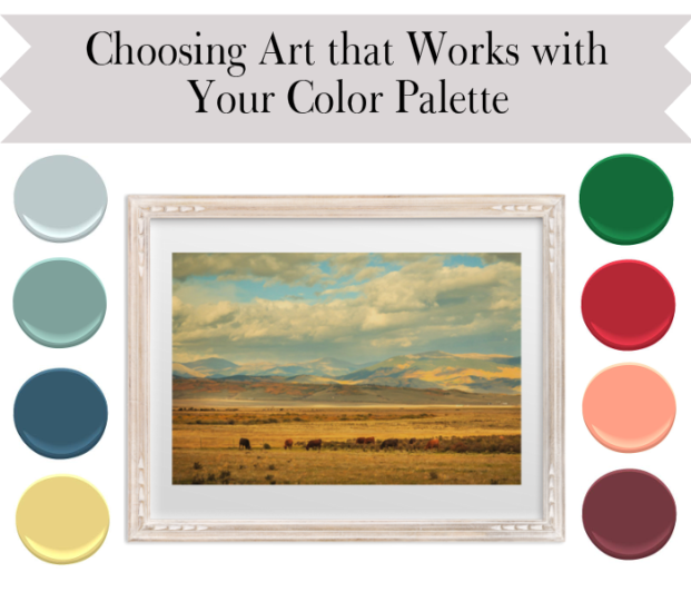
Today I want to talk a little bit about choosing art. Obviously there is a lot to consider when picking art for a room–for example style and scale, which could each easily take up an entire post–but for now I want to focus on choosing art as part of an overall color scheme for your space.
Like other accessories, art can “match” the colors in a room, or it can play off them for contrast. Art that shares roughly the same color palette can make a room feel cohesive; art that brings in a contrasting color can make a room feel dynamic. You can’t go wrong with either approach because really, adding art is always a good thing.
As I mentioned last week, we are partnering with Minted for this challenge, and I am including Debra Butler’s awesome Land of Infinity photograph in my room design. It was a tough choice because Minted has an amazing selection, and after I “narrowed it down” I was still left with at least about eighteen choices. BUT, I’m so so happy with my selection. I opted for the Whitewashed French Farmhouse frame, too, and love how it complements the subject matter.
Since I’m working with this print right now, I want to use it as an example of how you can choose either matching or contrasting colors with a piece of art. I’m calling them safe and creative options, which kind of sounds like one is better than the other (because we all obviously want to be creative), but I don’t mean it that way. The safe options are simply taken directly from the colors in the photograph, whereas the creative options play off the colors using roughly analogous or complementary color schemes.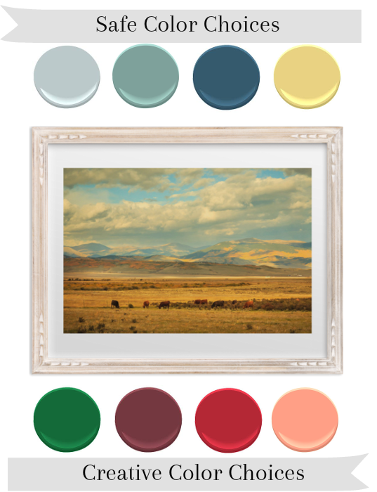
Top row, L-R: BM Smoke, BM Crystal Springs, BM Summer Nights, BM Treasure Trove
Bottom row, L-R: BM Seaweed, BM Raisin Torte, BM Exotic Red, BM Dusty Pink
It’s easy enough to see how the safe choices work with the photograph, but let’s talk just for a second about why you might ever consider using purple with a piece of art like this. (You may want to peep a color wheel during this chat. You can see one here). The dominant colors in the photograph are a light blue and a golden yellow. Green works with both these colors in an analogous color scheme (colors next to each other on the color wheel). Purple is an analogous color to blue and the complementary color (across on the color wheel) of yellow. Red together with yellow and blue forms a triadic color scheme (three colors equadistant from each other on the color wheetl) and pink is a take on this same scheme. Incidentally I do think the pink perhaps works the least well, though it could still be pretty in the right setting.
When thinking about an actual room design, I doubt you would want to use this photograph only with the creative color choices I picked, but I think mixing some safe options and creative options in an overall scheme with the photo would give you a result that both makes visual sense and provides a twist on the expected.
That’s what I’m trying to do in my guest room, which I’m refreshing in this challenge. I have blue on the walls and yellow on the desk, but I’m using an emerald green throw, and plan to bring in dark coral and other warmer tones through additional art and textiles.
 Yes, I hanged my beautiful new photo on an existing picture hanger where it looks totally wrong. It will be moving before next week! Since I moved the furniture arrangement off-center to accommodate the desk, I plan to put up some other art in kind of a loose gallery to balance the look on the wall.
 The matching chair was just a little too much with the desk, so I brought this rattan chair out of the basement. I have a pair of these, and they’ve been in about every room in my house at some point. They are good everywhere!
 Some of the other art I’m planning to use. I’m thinking the different colors in these accents will bring variety and also tie a few of the elements together.
My Lamps Plus Color Plus lamps should be here today, and I’m excited to see what they bring to the space. As a reminder, I’m using the Double Gourd table lamp in West Highland White.

Here’s a quick rundown of the plan for this room before the reveal next week:
- Install new baseboards (Justin still plans to do this. The room needs it, but I’m fine even if it doesn’t happen this week).
- Accessorize bed with an actual duvet, real covered pillows, etc.
- Find additional rug/floor covering.
- Hang art.
- Hang curtains (I have a stash, all from Ikea, that together probably cost less than one curtain panel from somewhere else).
- More plant power.
- Style it up!
Now, don’t forget to hop over to visit the other great bloggers participating in this challenge. There’s a ton of variety in the spaces they are taking on, and you don’t want to miss a single one.

Casa Watkins | Shabby Grace Blog | Domicile 37 | Pretty Practical Home
Up To Date Interiors | A Designer At Home | Iris Nacole | Vintage Romance Style
This Is Our Bliss | Seeking Lavender Lane
Finally, thanks again to our sponsors for providing decor for this challenge!

See you next week!

Looking good. I love that paint by number and side table. Can’t wait for the reveal!
LikeLike
Thanks, Maggie! I love that paint-by-numbers, too, and I’ve actually never used it in a space, so I’m excited to put it to good use!
LikeLike
Looks fantastic. The room is looking great. Love the color palette you chose! I’m a big fan of mixing blues and greens. Love the green blanket on the bed with the blue wall color. LOVE LOVE
LikeLike
Thanks so much, Stephanie! I’m a blue/green girl all the way, too. I’d totally steal your new rug, lol. 🙂
LikeLike
Pingback: New Year, New Room Refresh Challenge | Master Bedroom Week 2: Progress + Tips for pulling together a Gallery Wall - This is our Bliss
It’s looking so good! I’m in love with that desk chair too! Can’t wait to see what you share next week!
LikeLike
Thanks Iris! I know, the chairs are so good. Even when they’re not being actively used I know to keep them on hand. Like you, I have a lot of extra decor on deck, so to speak. 🙂
LikeLiked by 1 person
Pingback: New Year New Room Refresh: DIY Cord Covers - Up to Date Interiors
More plant power- chyea! This is a really awesome lesson on color theory!
LikeLike
Thanks, Corinna! And I know, plant power all the way! I’m looking forward to maybe getting a new plant baby 🙂 🙂 🙂
LikeLike
Pingback: New Year New Room Challenge Mudroom Update - Pretty Practical Home
Pingback: New Year New Room [Play Room Makeover - Week 2] - Shabby Grace
Looking good!! I’m really digging your style! The desk is oh so lovely!
LikeLike
Thank you so much, Sara! I love the desk, too. 🙂
LikeLike
Awesome paint color tips! I love the shades of green in your room – they work effortlessly together! And I saw your lamp on insta…It looks great in your space!! Looking forward to the big reveal day! -Rachael
LikeLike
Thanks, Rachel! I love the lamps; they are definitely helping bring things together!
LikeLike
i really like how you broke down the safe/creative color choices…i will not lie,my eye was drawn to all the creative colors. you really have a way with mixing and matching, everything from colors to prints…love it!
LikeLike
“Plant power” made me giggle. That’s my favorite design tip of all time–put a plant in it. I love the color options you shared and the print is gorgeous. Looking forward to seeing it all pulled together.
LikeLike
“Put a Plant In It” is definitely going to be the design power ballad of 2016, I think. Move over, Beyonce!
LikeLike
Great tips for choosing colors! Love the lamp and art piece you picked out. Can’t wait to see your room next week!
LikeLike